Design and Code
Avista Corporation
UX Design
Pearson Packaging Systems (Part 1)
Pearson Packaging Systems (Part 2)
Research
MemJet
My portfolio of projects with demonstrated positive outcomes. I've been fortunate to be a part of teams with many talented and dedicated individuals.
Notable Projects
Avista corporation
Design System and Code Prototypes
Overview
The Avista Corporation has an internal tool named ADSS or Advanced Decision Support System for energy optimization and trading.
ADSS was previously a standalone and single platform application. The goals were to update the ADSS into a multi-platform web application.
This required created a Design System and real-working prototypes with real-data.
Real-working prototypes with real-data. Get to real-faster.
Client:
Avista Corporation
Dates:
2022-24
Platforms:
- Web application for mutliple platforms
Tools
- Figma for the Design System
- HTML, CSS, and JS for the prototypes
- GitHub for version control
- Web application in React JS
Links
-
Example prototype of ADSS
- Note: This is an internal and secured application
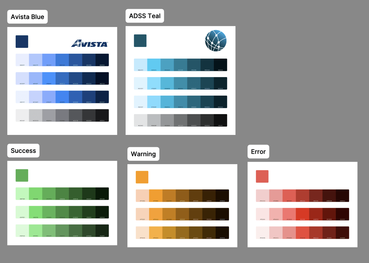
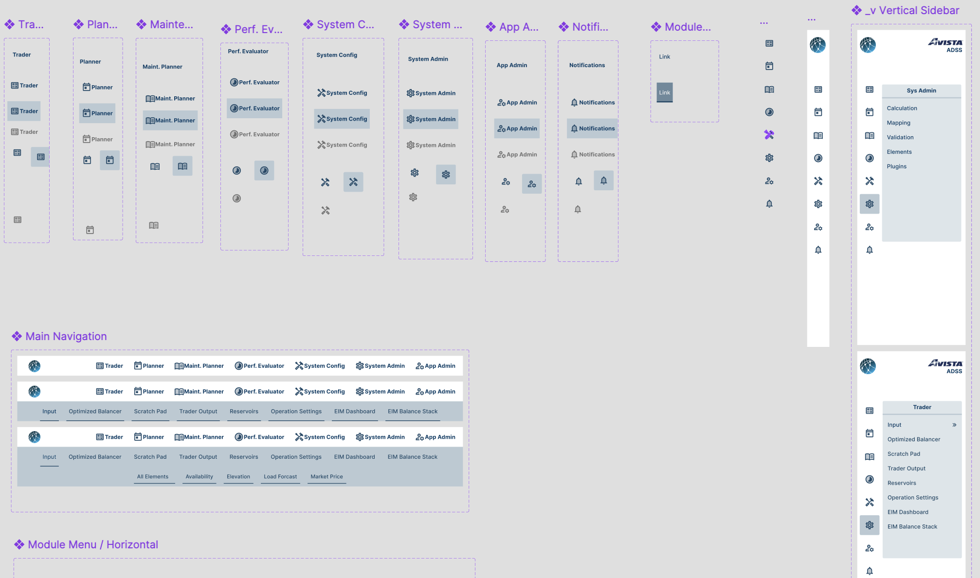
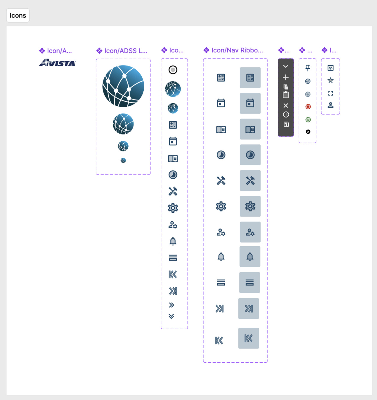
Figure 1: Design System components, tokens, and docs.
Figure 2: Prototypes coded in HTML, CSS, and JS for use in React components.
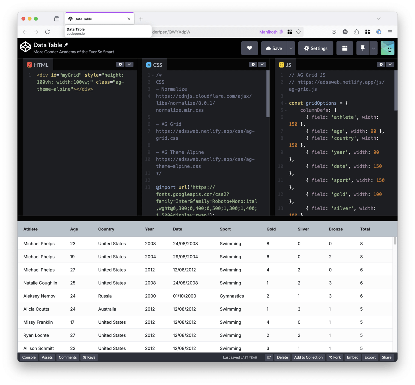
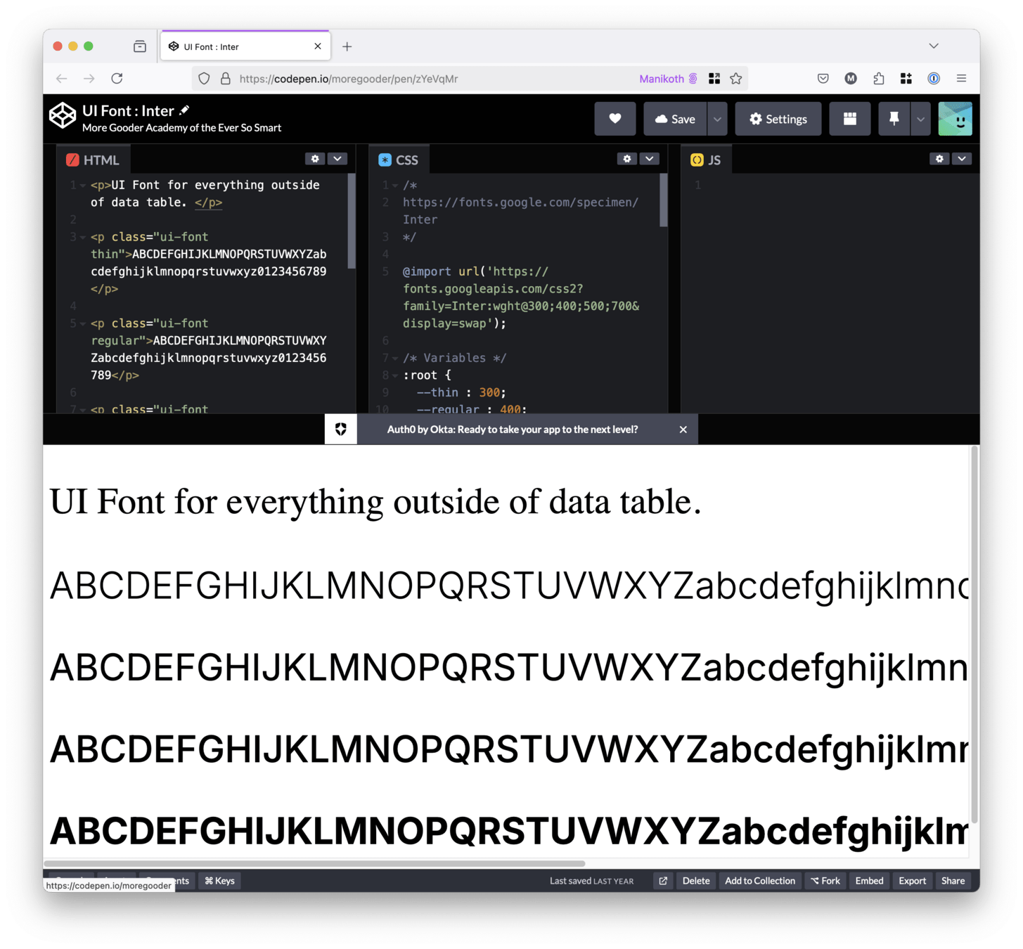
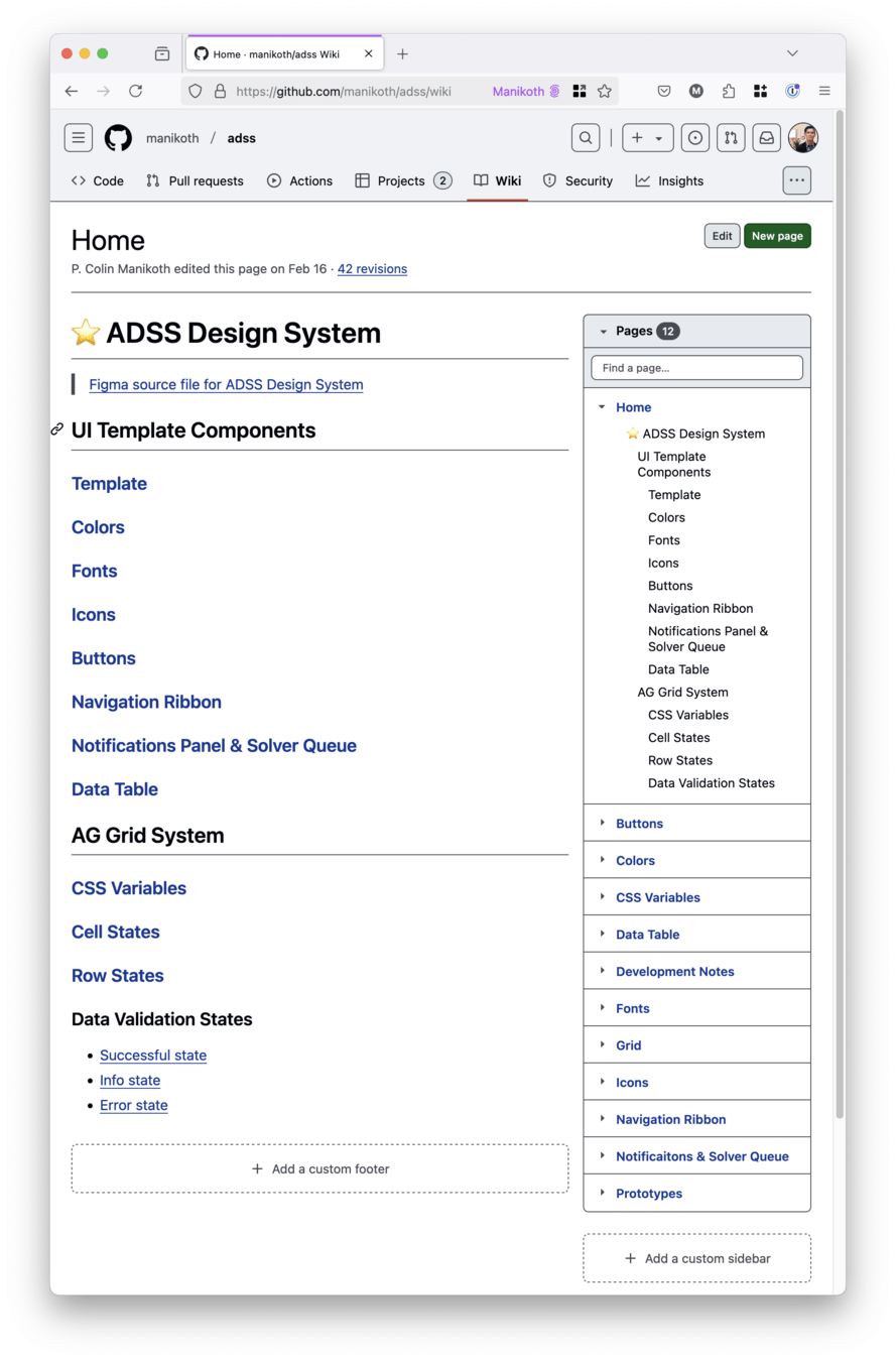
Figure 3: Version control to keep Designers and Developers on the same page.
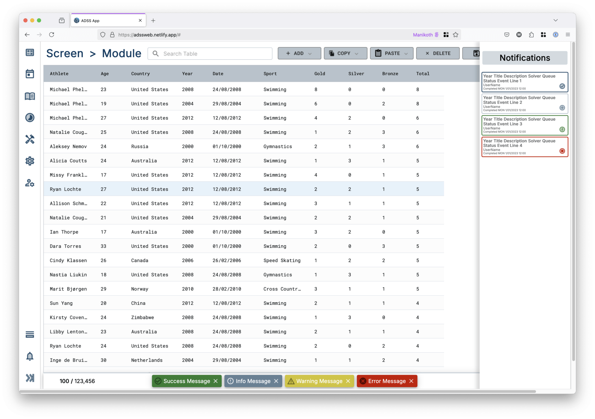
Figure 4: "Kitchen sink" view of working designed and coded components and tokens.
Pearson packaging systems
Part 2: Design System
Overview
A UX Design System is a "single source of truth" for designers and developers. It's a collection of reusable components, patterns, and guidelines that help maintain consistency across a digital product.
The User Centric Design (UCD) team updated the Design System for the HMI or human machine interface to version 3. The HMI allows human operators to control complex machinery.
One Design System for the entire product line.
Client:
Pearson Packaging Systems
Dates:
2016-2017
Platforms:
Tools
- Sketch app for user interface design
- Axure app for wireframe prototyping
-
InVision app for research and feedback
-
Note: InVision app shuttered in 2024
-
Links
Completed
- Reduce Complexity of Equipment: With many types of packaging machinery, a design system would ensure consistency across various interfaces, making operation intuitive regardless of the specific machine.
- Efficiency of Development: The Design System helped keep stakeholders, engineers, designers, programmers - and most importantly - the operators on the factory floor - in alignment.
- Improved User Experience: By establishing consistent patterns and interactions, a design system would reduce the learning curve for operators working with different machines.
- Brand Consistency: A unified design system reinforced the Pearson Packaging orange-brand identity consistent across the digital HMIs to the physical controls.
Figure 1: Design System 2.0 (left) and updated Design System 3.0 (right)
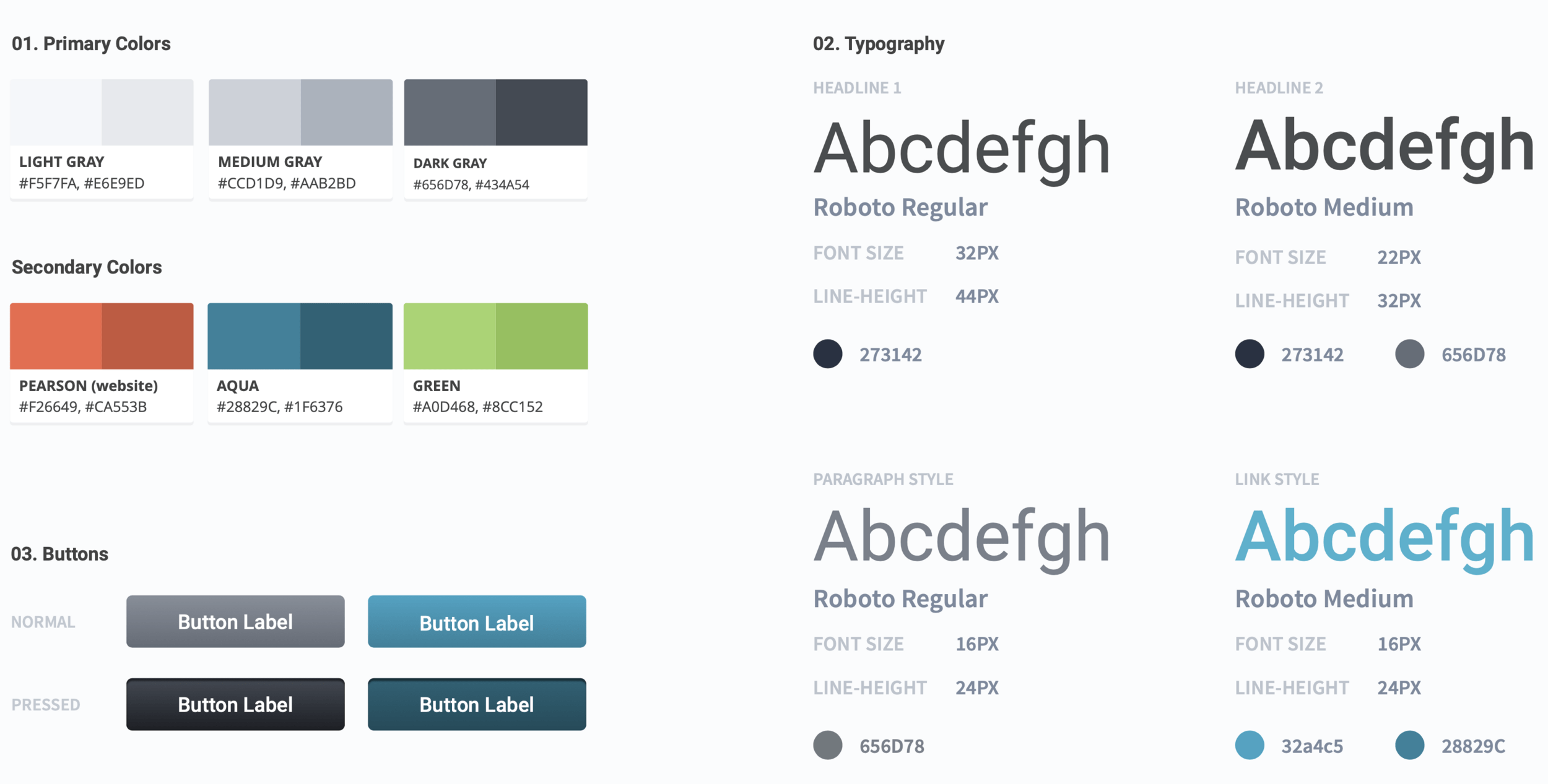
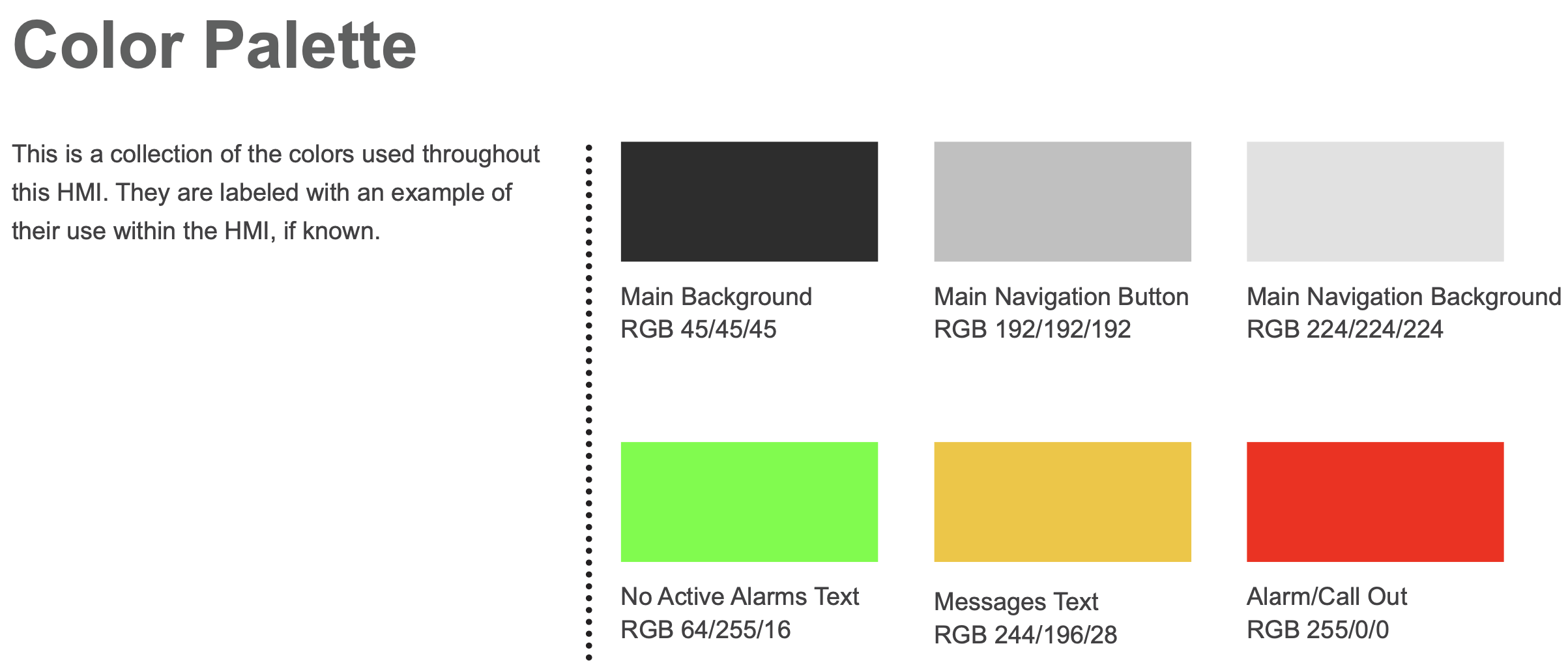
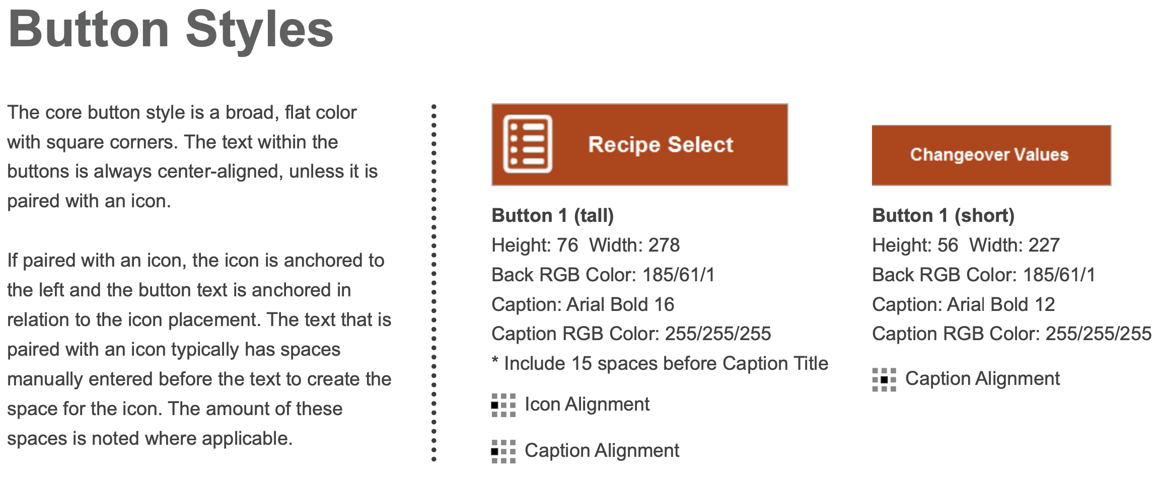
Figure 2: Design System 2.0 (left) and updated Design System 3.0 (right)
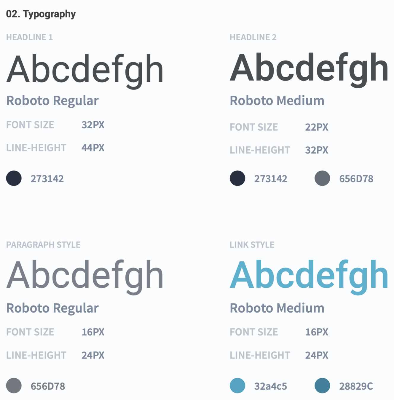
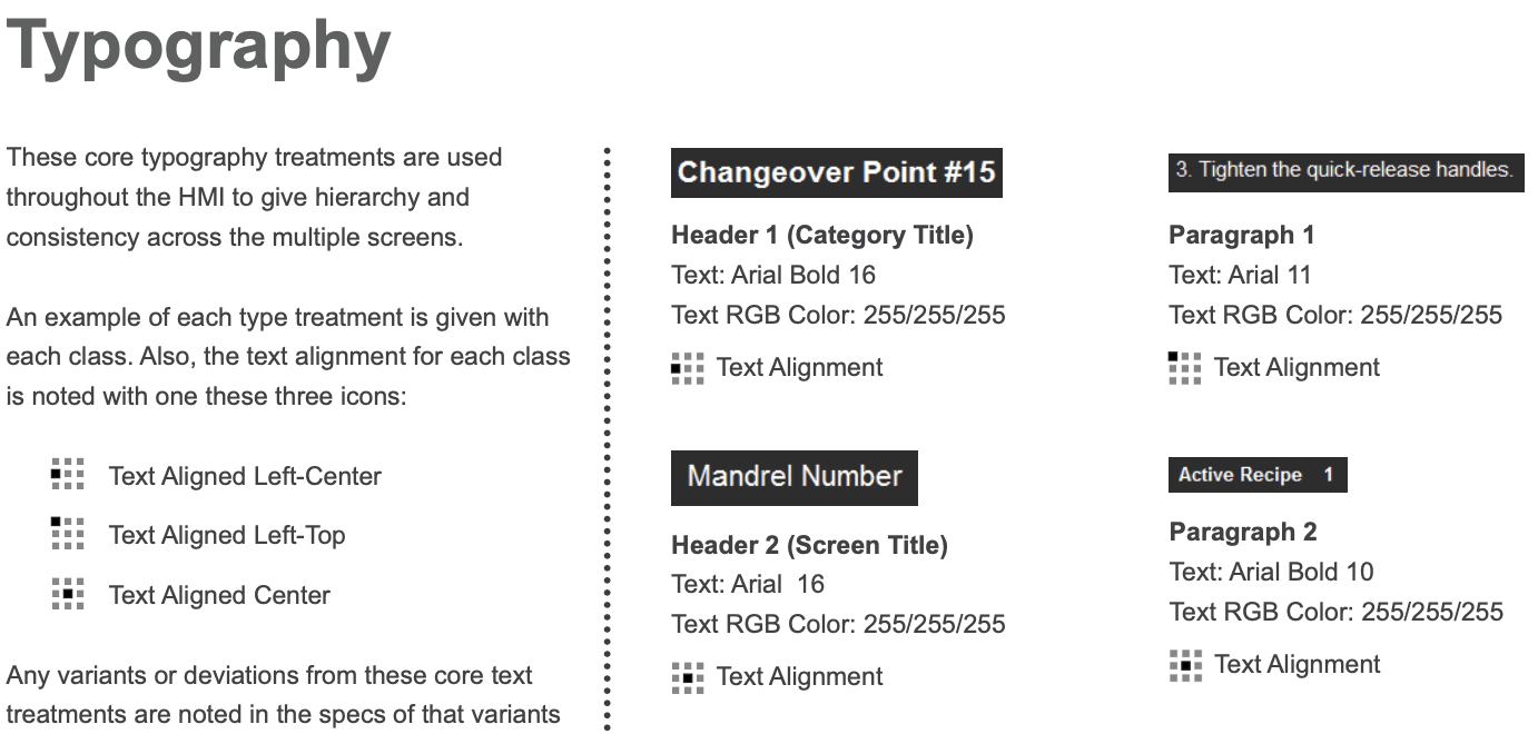
Figure 3: Design System 2.0 (left) and updated Design System 3.0 (right)
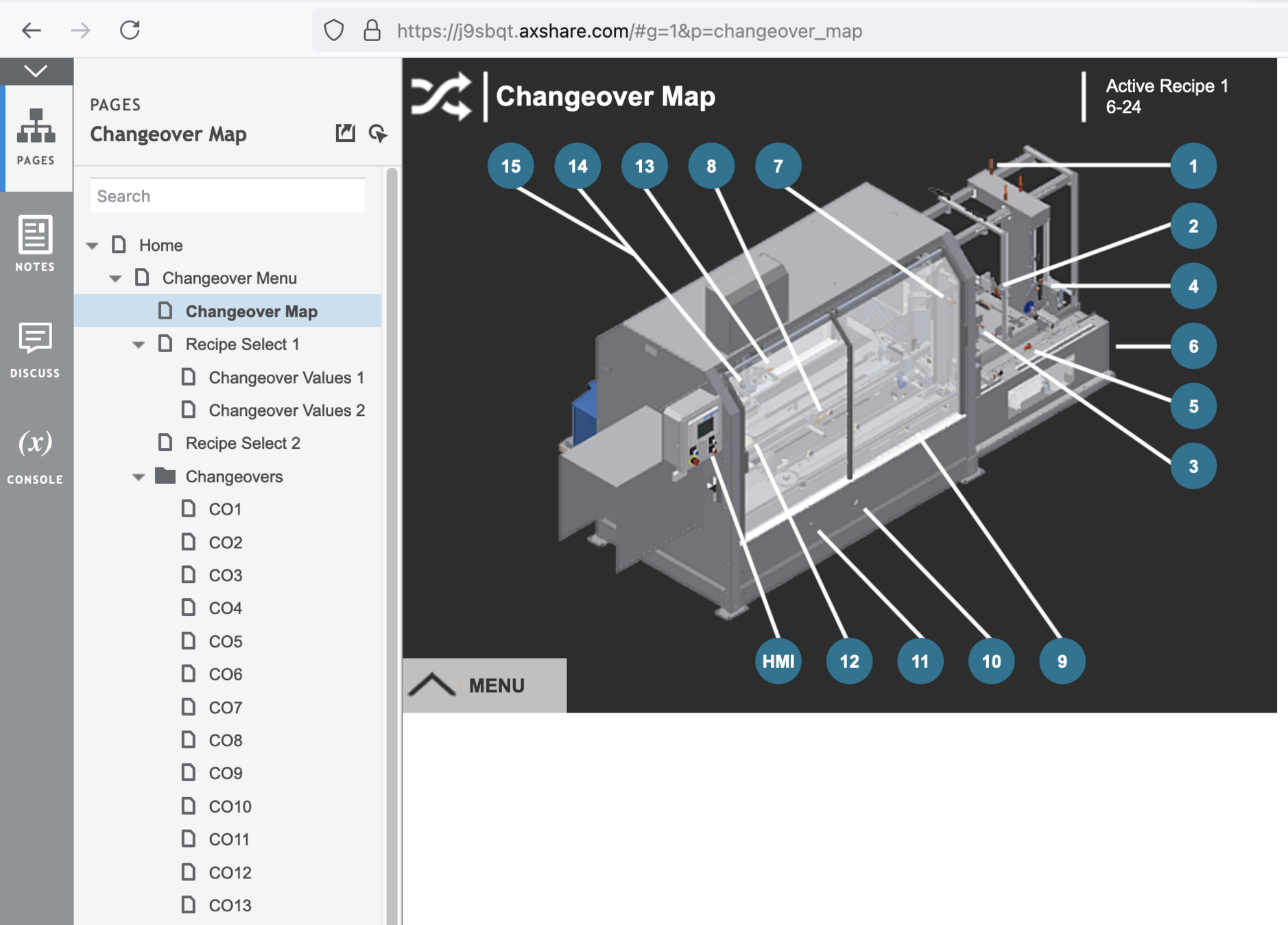
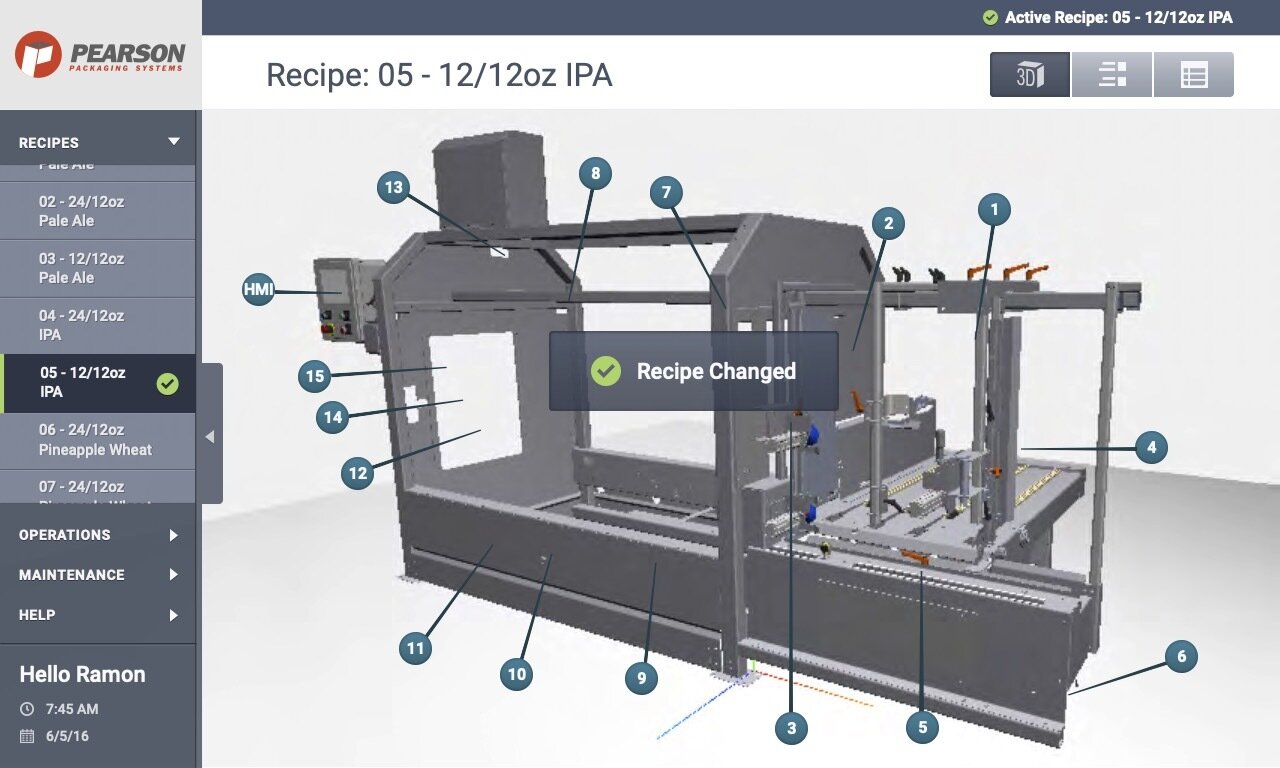
Figure 4: InVision app to share user flows and code with developers.
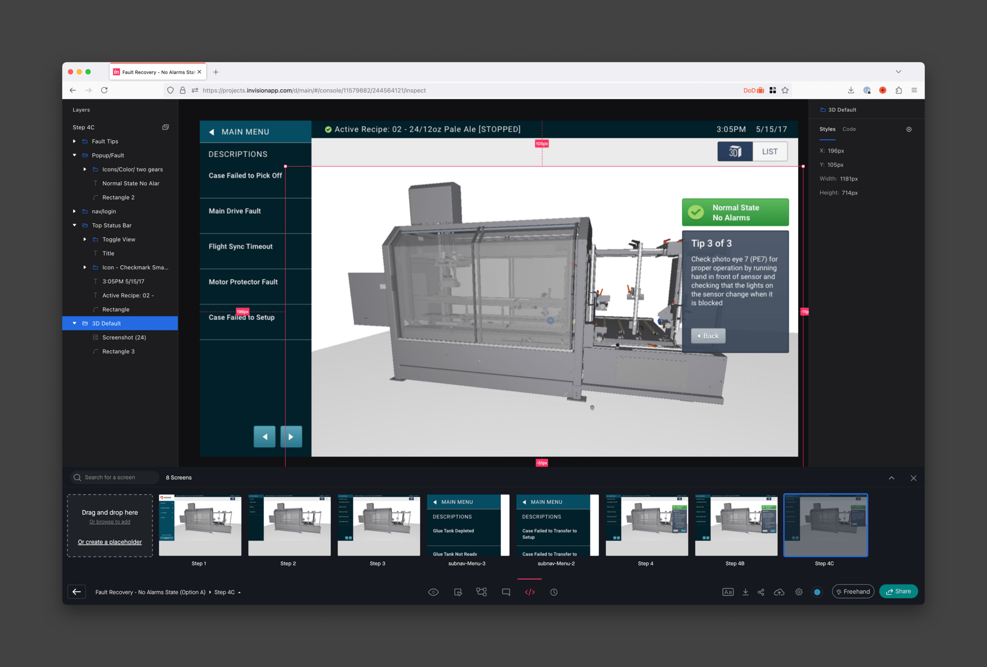
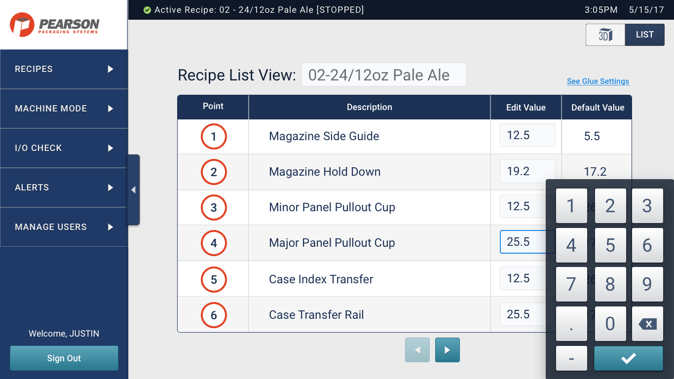
Figure 5: Detail of administration panel.
Figure 5: Machine operator views.
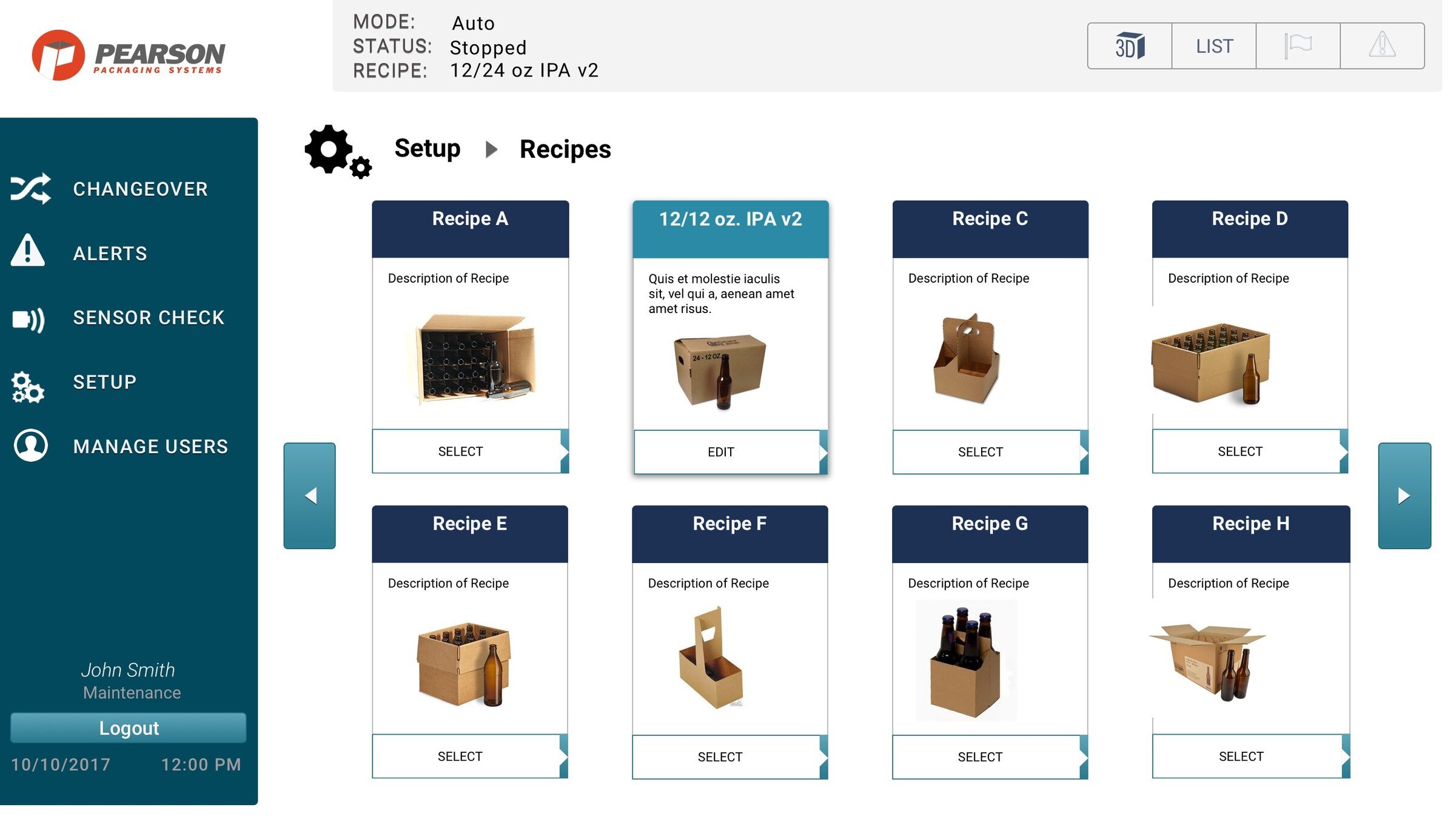
Pearson packaging systems
Part 1: UX Research
Overview
Pearson Packaging Systems specializes in designing and engineering packaging equipment for "boxing up" consumer products. The User Centric Design (UCD) team designs the human machine interfaces or HMI for operating the equipment. I was apart of the team redesigning version 3 of the HMI aimed at making tasks easy to learn, fast to perform and error-free for operators of any skill level.
Make the human experience with industrial machinery better.
Client:
Pearson Packaging Systems
Dates:
2016-2017
Platforms:
Tools
-
InVision app for research and feedback
-
Note: InVision app shuttered in 2024
-
- Axure app for wireframe prototyping
- Sketch app for user interface design
Links
- Axure prototype
- See videos of the HMI screen user interfaces
- Embed Adding, Editing, and Copying Recipes
- Note: InVision app shuttered in 2024
Completed
-
Interviews: We had interviewed the people who operated the equipment on a daily basis. Their feedback was invaluable. We better understood their challenges, undocumented workarounds, and the limitations of the current version.
-
User Interfaces Audit: We first took an extensive inventory of all the interfaces. It was systematic evaluation every machine interface to identify usability issues, inconsistencies, and areas for improvement.
-
Information Architecture: We restructured and organized information. Evaluating the navigation system, menu structures, labeling and categorization of features and functions into logical groupings.
- Digital Prototypes: Using Axure app and later the InVision app, mid-to-high fidelity digital prototypes were created for the operators, engineers, and stakeholders for review before development.
- Physical Prototypes: Packaging machinery have both on screen digital interfaces and also physical controls. Physical prototypes were created with stickers to simulate controls and cardboard mockups for spatial relationships.
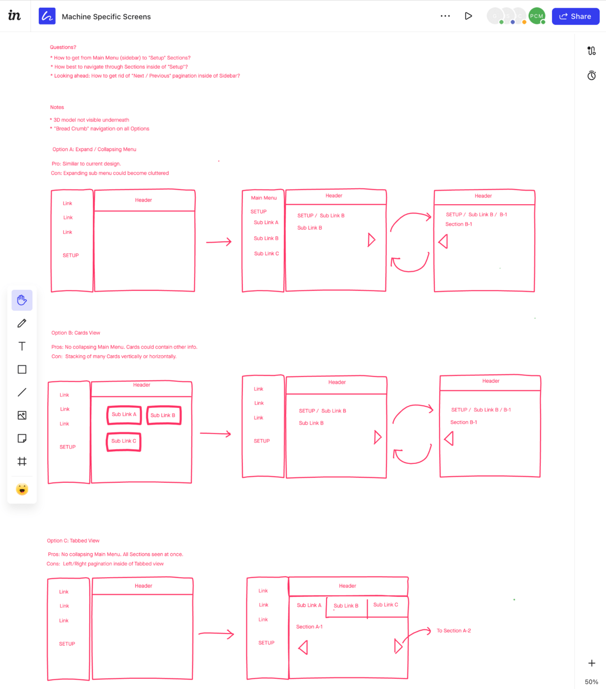

Figure 1: Version 2.0 Axure prototype (left) used for early lo-fi mockups in InVision (right).
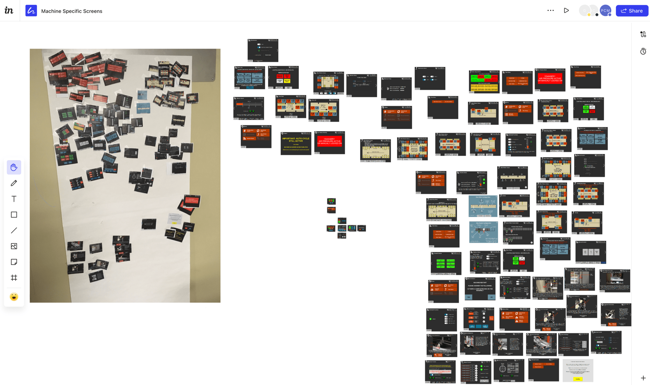
Figure 2: UI inventory with physical cutouts (left) and digital screenshots (right).
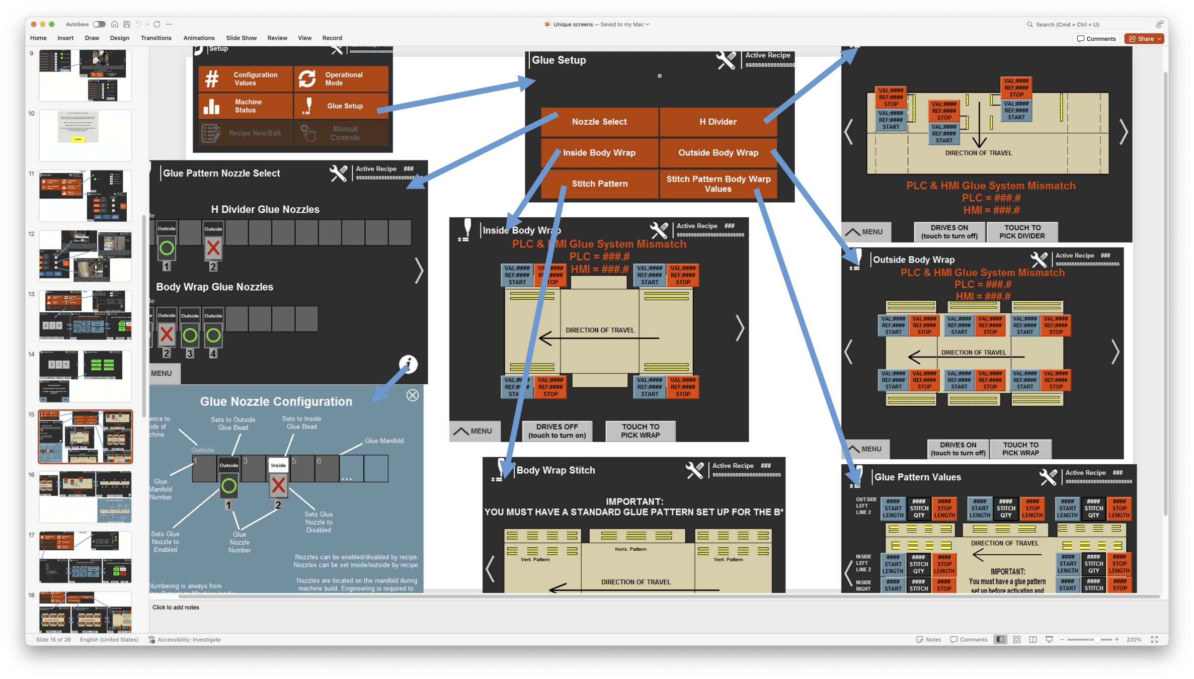
Figure 3: Powerpoint file to quickly map userflows, cognitive load, and inconsistencies of version 2.0.
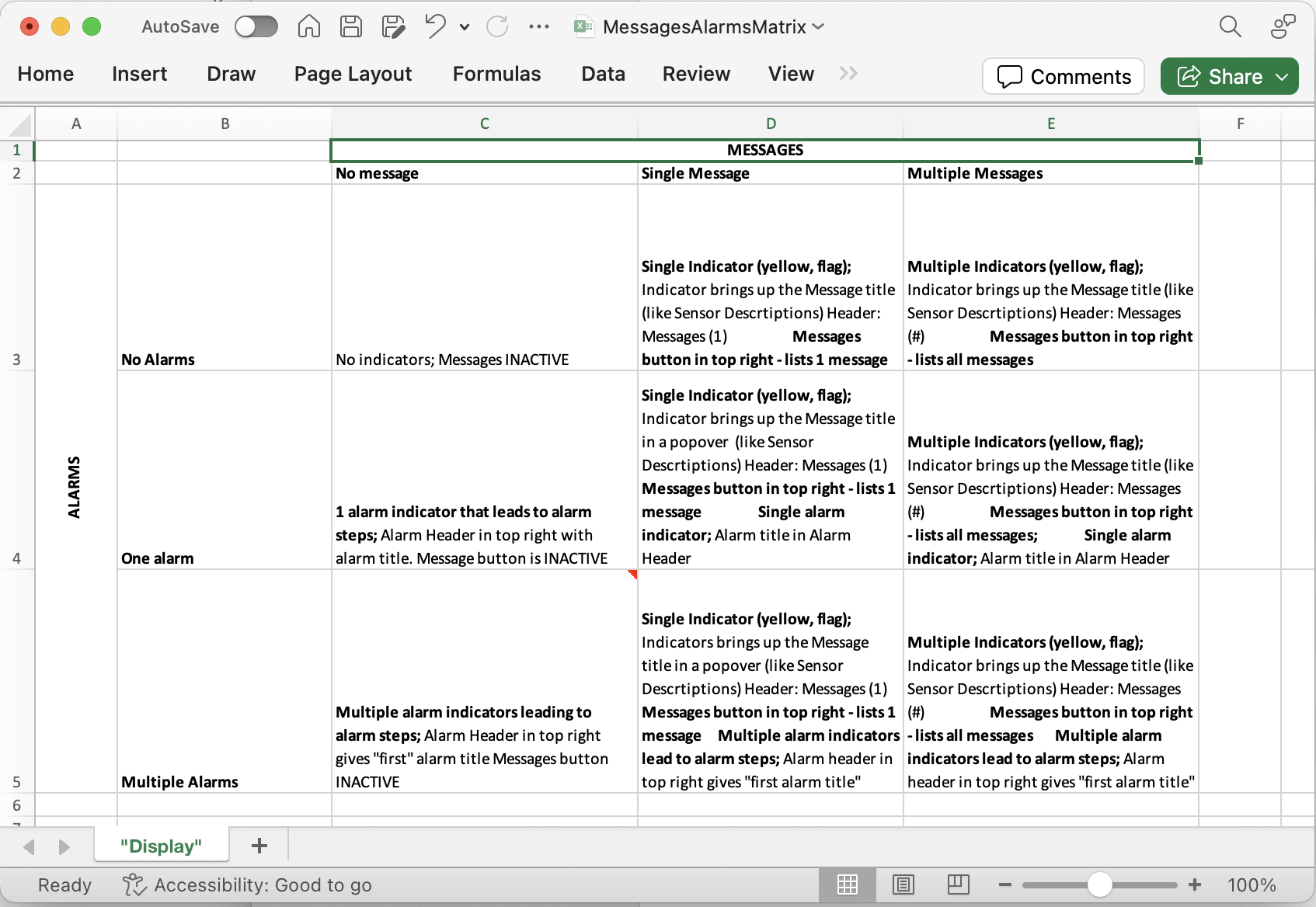
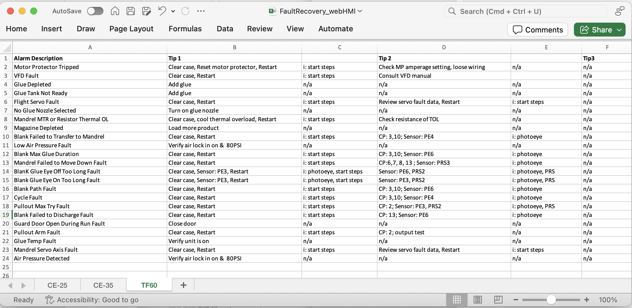
Figure 4: Excel spreadsheet to align interface design with engineering specifications.
Figure 5: Stickers on digital screens and physical machinery to convey ideas and revisions to operators, engineers, and stakeholders.
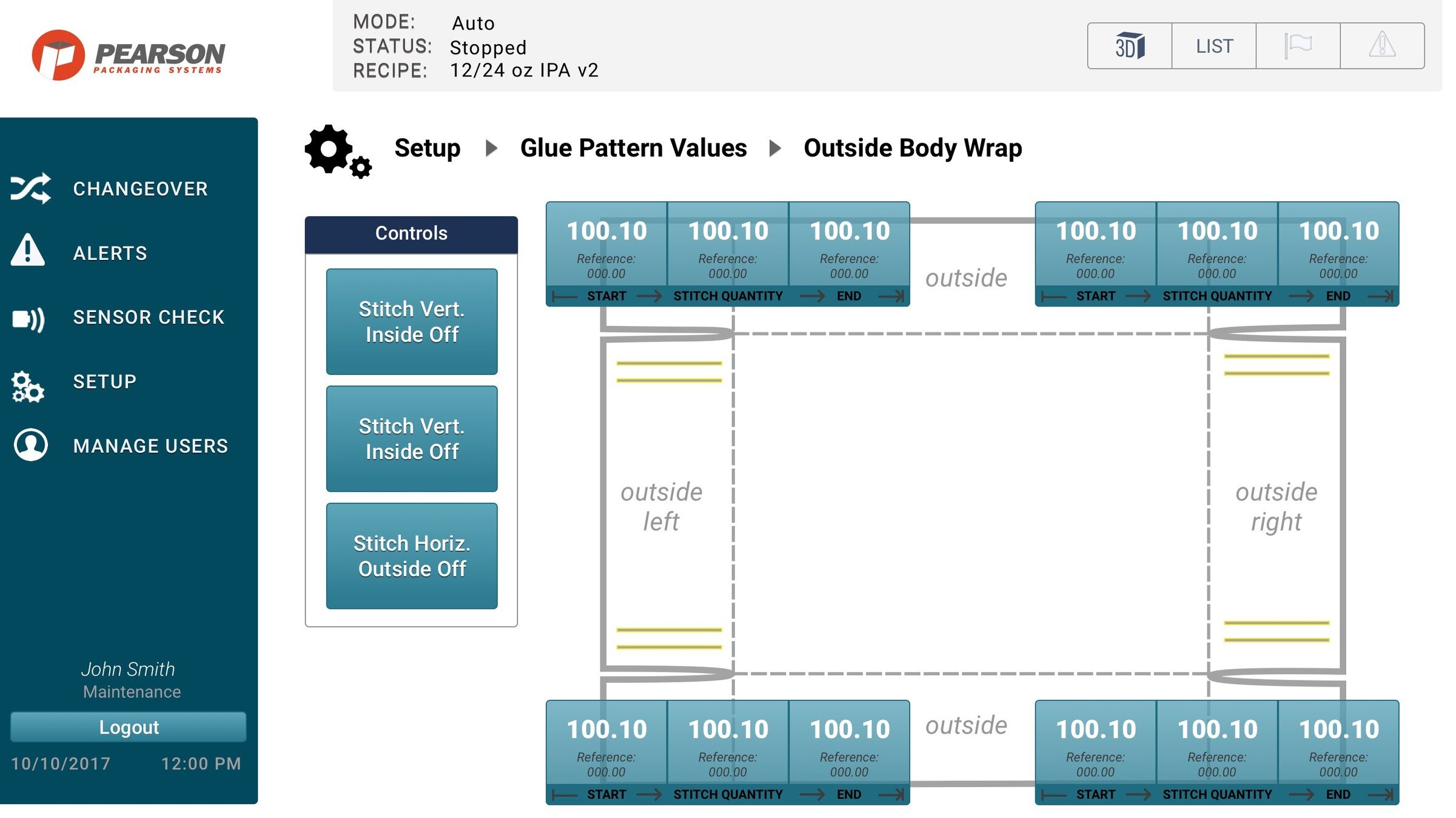
Figure 6: Physical mockup of glue patterns (left) and the digital interface controls (right).
Figure 7: Completed Human Machine Interface (HMI) utilizing the Design System.
Memjet
Memjet.com Website Audit
Overview
Memjet.com was not performing as expected. Over a few weeks, I researched, gathered, and analyzed data to make recommendations to improve the overall usability, content strategy, and user flows. I presented my data-driven-recommendations which resulted in increased lead-generating sales for the printing technologies company .
We are now seeing positive results from the website redesign?
Client:
Memjet via Magner Sanborn Advertising (now Chapter and Verse)
Dates:
2014-2015
Platforms:
- Desktop Website
- PHP content management system
Tools
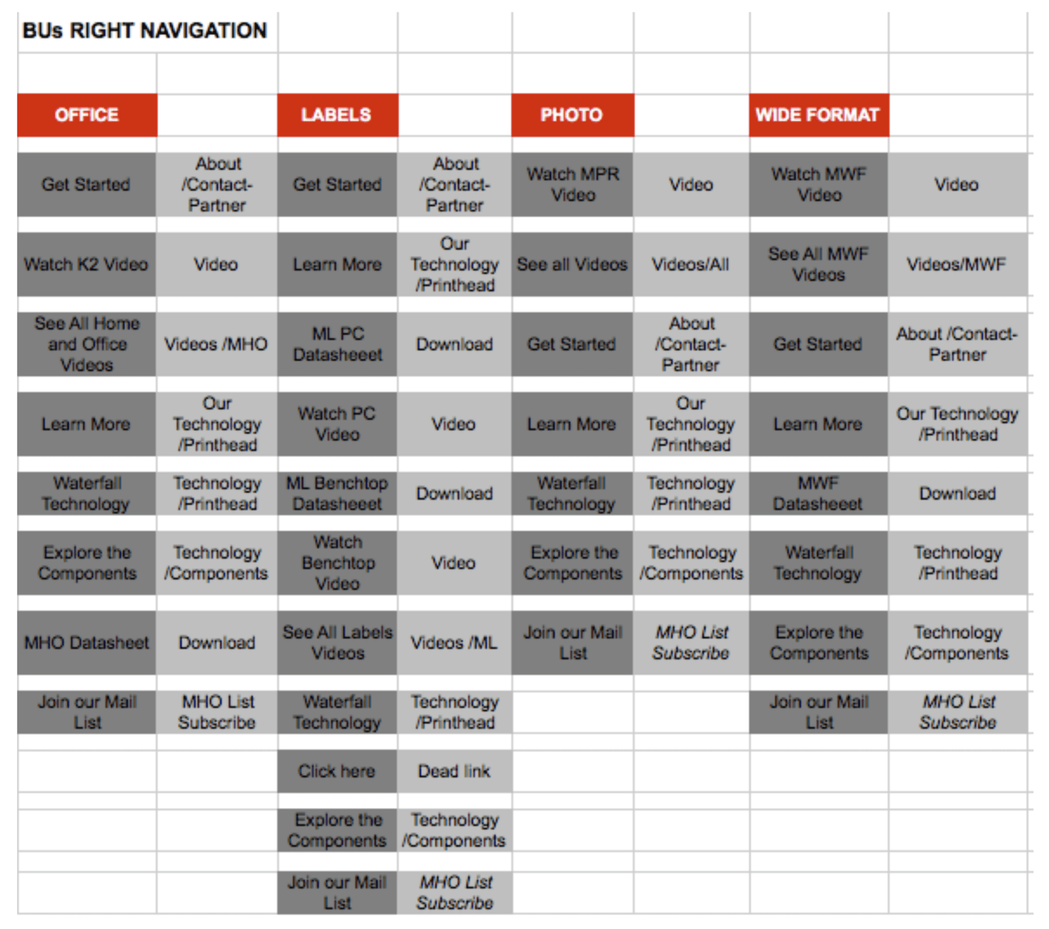
- Data provided from internal server side logs, HotJar.com, and Google Analytics.
- MS Excel to analyze server side metrics
- Powerpoint to present finding
Links
- Download completed report (PDF)
- Memjet.com (archived website)
Completed
-
Heuristic Evaluation: I assessed the usability of a website's visual design, navigation paths, and micro-interactions throughout the entire site.
-
Visual Hierarchy Assessment: I determined improvements to the design of the homepage's visual hierarchy, positioning of elements, and content groupings.
-
User Flow Analysis: Starting with the homepage, I used page view counts, click rates, heatmaps, 5-second tests, and A/B testing, along with client feedback, to understand users' paths.
-
Content Audit: I recommended a content strategy to prioritize becoming a lead-generating site while supporting the established brand, e.g., "add a video on the homepage".
-
Data Analysis: Conducted data analysis using metrics provided from internal server-side logs, HotJar.com, and Google Analytics.
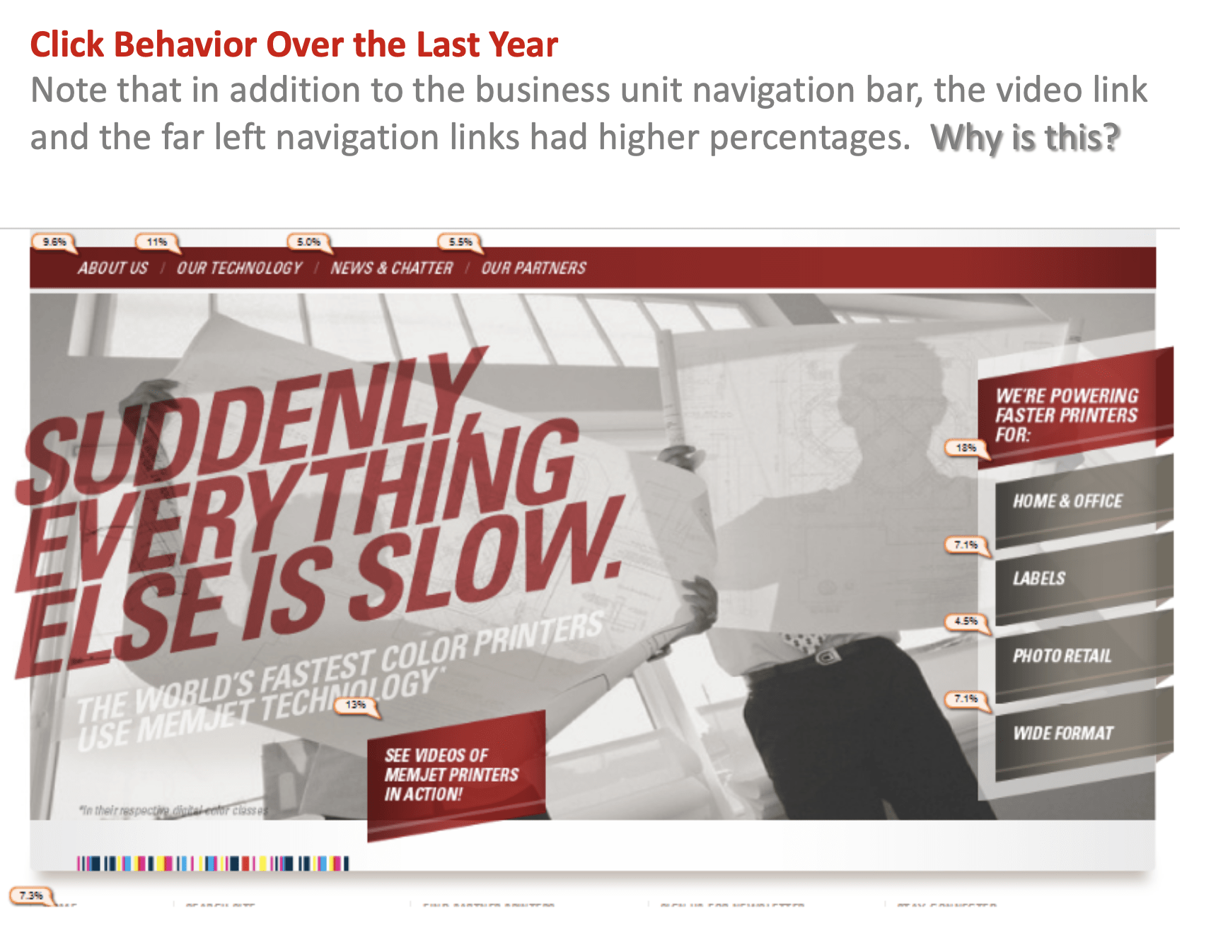
Figure 1: Track user click percentages then compare against page visits.
Figure 2: Is the navigation effectively guiding users to content?
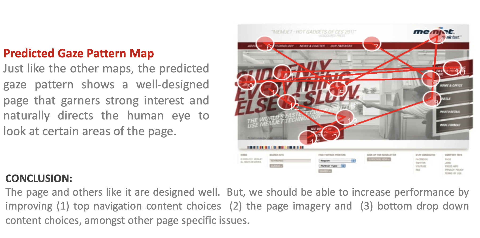
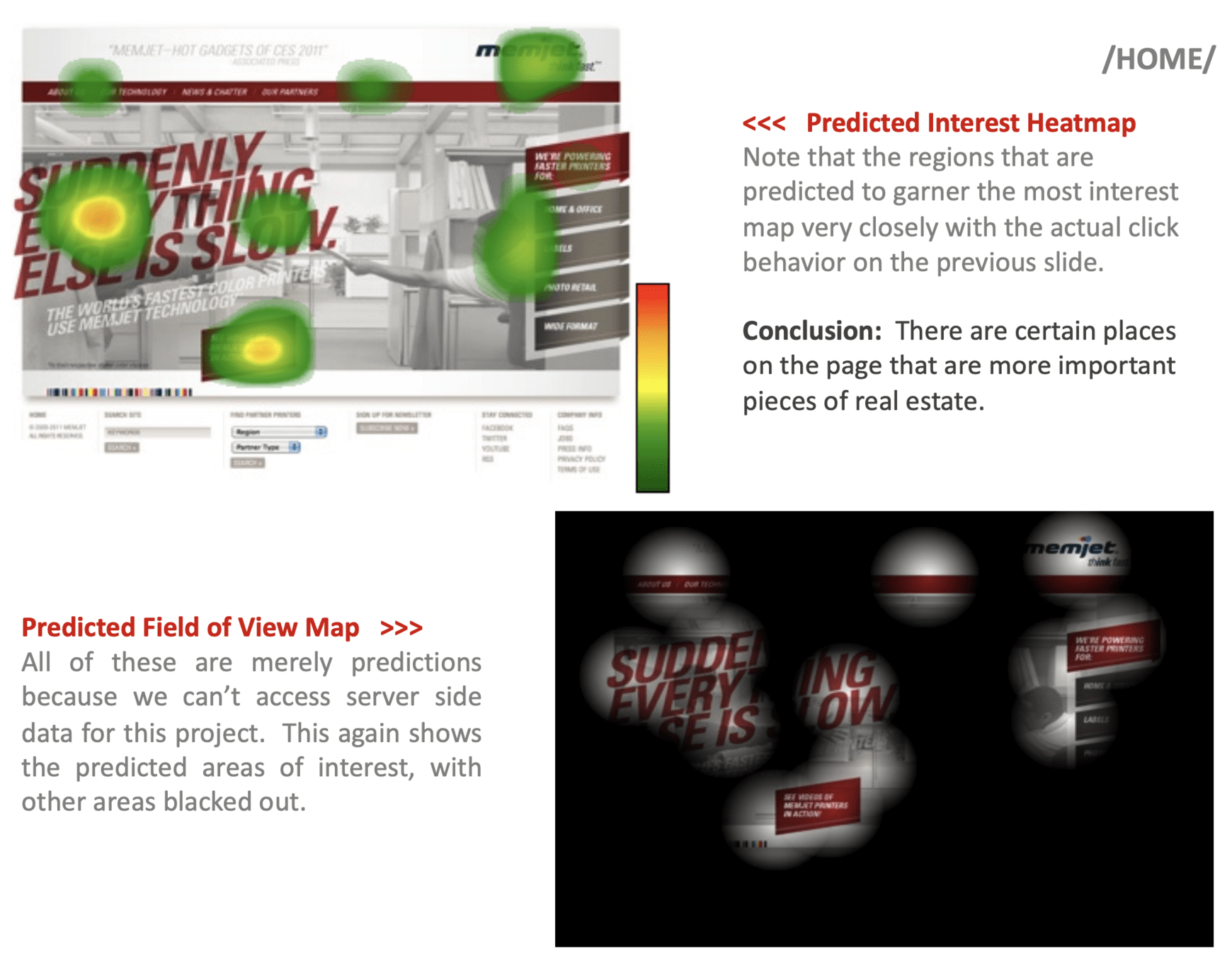
Figure 3: Visual analysis supports feedback from user interviews
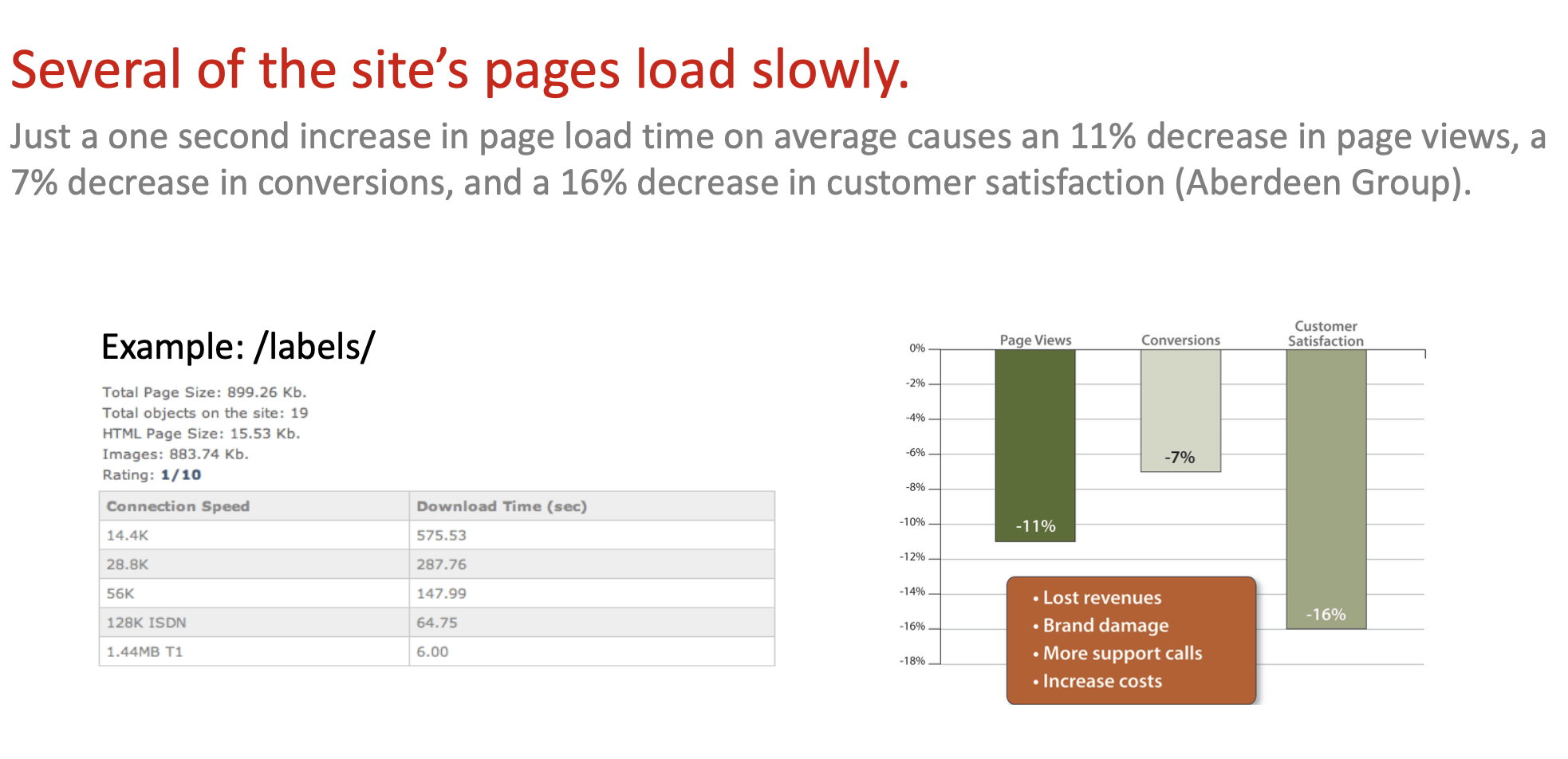
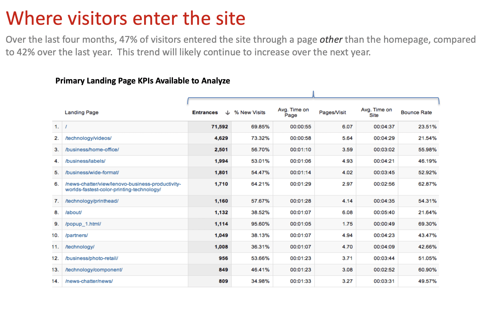
Figure 4: Data gathering from internal and external sources
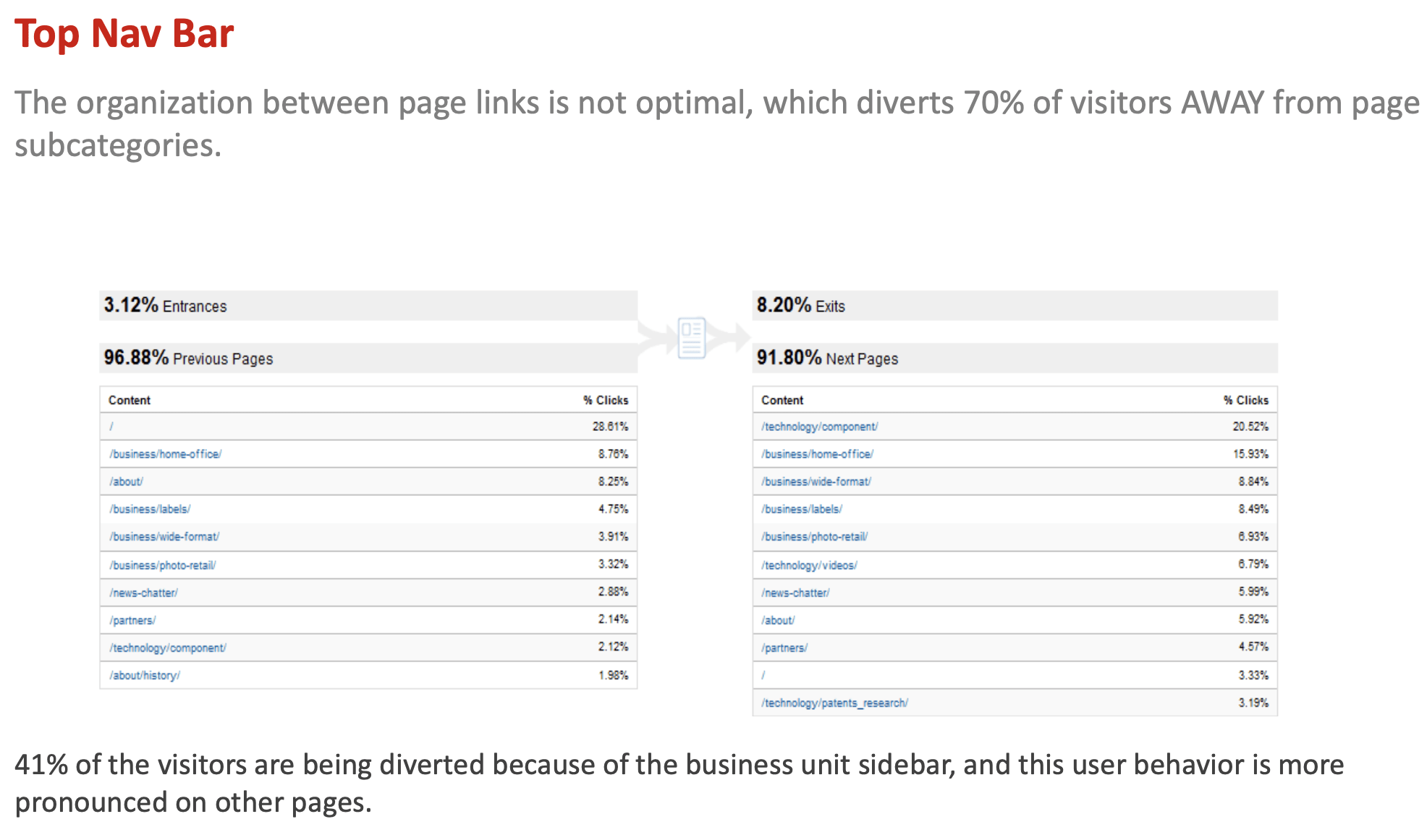
Figure 5: Revised information architecture planning
